

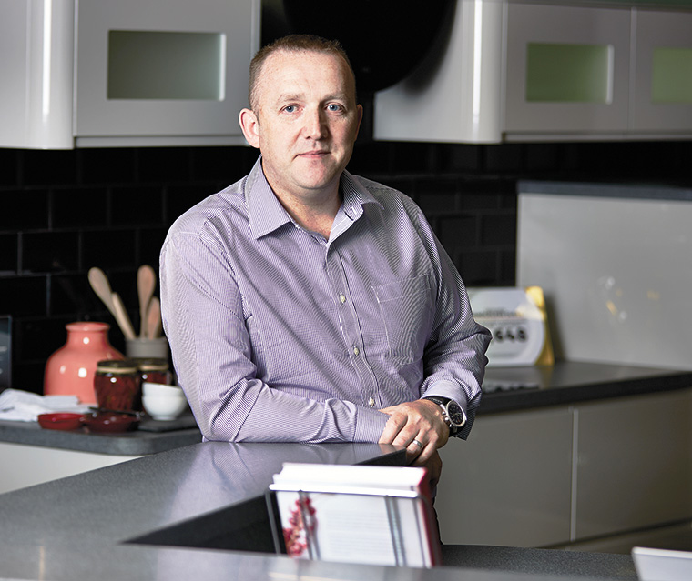
Wren Kitchens’ design director, Darren Watts
.
Increasingly, home renovators are eager to create a unique space that’s personal to them, and colour plays a major part in the overall aesthetic and charm. Retailers offer a vast array of colour options, and this abundance of choice can be overwhelming. However, with a little bit of know-how and expert advice to guide you along the way, adding colour can create a unique, showstopping look in modern or traditional spaces.
Remember, a good-quality kitchen should last over 20 years, so it’s wise to choose a colour palette that you’ll love for years to come. Whether it’s a bold statement island or light pastel hues, the use of technology such as 3D virtual reality brings your dream kitchen to life and helps you make those final tweaks.
Typically, whites, creams and greys are used for a classic kitchen look, but taking risks with contrasts of darker colours or pops of playful accents is becoming a theme to create a showstopping statement or simply a glimpse of personality.
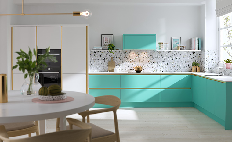
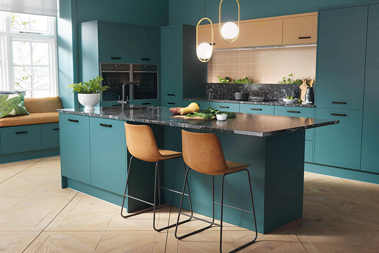
We’re seeing a significant rise in darker cabinetry such as blueberry blues, forest greens and inky blacks, as well as retro pinks, mint greens and pastel purples. Textured cabinetry is also increasing in popularity, as we’re seeing an influence from natural materials such as concretes, slates and marbles.
Remember, it doesn’t have to be overpowering – especially if you have a smaller space, as colours can be injected with two-tone colours, splashed on wall cabinets only, or even open feature units.
Colour options that always look good in the kitchen
The traditional Shaker design lends itself perfectly to an array of bold colours just as well as the contemporary clean lines of a Milano style, so don’t be afraid to embrace new shades, whatever style you have chosen.
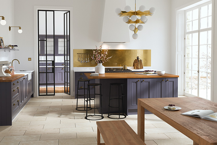
In particular, we’re loving blueberry blues, forest greens and inky blacks, with gold finishing touches for a luxe combination. For a more traditional, retro look, opt for a soft sage with pale pink walls, or a pop of apple green on your units from Wren’s sophisticated Macaroon collection.
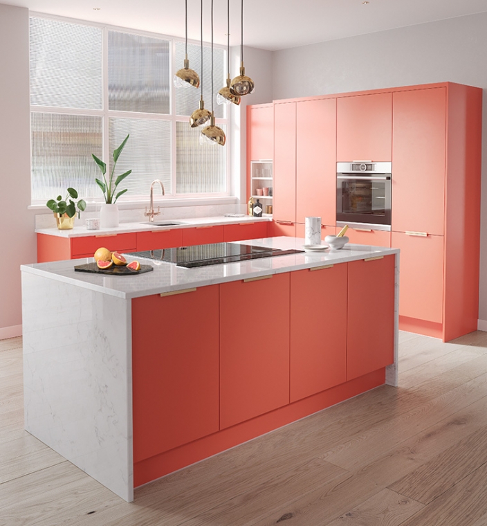
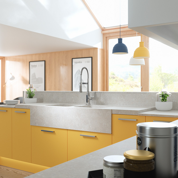
For a playful combination, opt for the sunshine rays of bumblebee yellow combined with Baltic blue floor to ceiling units and whitewashed walls. Or to create a party kitchen, opt for a standout spearmint island with gold profiling, toned down with pure white cabinets.
Remember, it’s key to pare the look back with neutral walls and tiles, as well as complementary worktops such as chunky timber or icy quartz. In smaller spaces, be smart with your palette, and don’t choose an overpowering look that will look enclosed.
Darker colours in the kitchen
Taking risks with contrasts of darker colours is becoming a theme. Dark kitchen cabinets represent an elegance and a rich luxurious aesthetic, casting a little drama over the room. Team deep, bold colours with metallics and statement flooring, but remember to pare them back with neutral tiles, paint finishes or even exposed brick, to ensure your space isn’t overpowered.
The use of raw materials which are rich in tones and textures will continue to rise in popularity, and Wren’s Elements range is a perfect example of this. It takes influence from naturally inspired colours and patinas such as marble, copper, concrete, slate and rust. Create a raw, industrial look with weathered-steel exposed units and concrete-coloured units.
Making any colour look at home in the kitchen
The finer details and finishing touches are important to ensure your kitchen has a style that’s personal to you – it’s the little things that count! To add boho vibes, showcase items you’ve collated over time from your travels on exposed shelving or feature units, and add splashes of metallics in cabinetry profiling, or a statement tap and handles to make a difference to the overall feel of your space.
Co-ordinating coloured cabinets
The key is to find a common theme between colours such as tones and retro or bold colour schemes. Be adventurous by choosing one statement colour for a focal piece in your kitchen, such as an island or dresser, and team it with a neutral shade for the rest of the units to pare it back.
However, one bold shade can lack interest – so why not pick and mix? Put the darker shade on the units and the lighter on the walls for a fresh look.
Top tips for smaller kitchens
Try to keep it simple. If there’s too much colour going on in one small area, the kitchen could end up looking chaotic. Stick to one or two colours and choose similar shades for the cabinets, walls and floors. Wren has nearly 2000 colours to choose from in its Spectrum range, including neutrals and perfect pastels which would enhance any smaller kitchen.
Also take advantage of the array of integrated storage options to free-up worktop and floor space, such as magic corners, pull-out recycling bins, spice racks and pet beds – and not forgetting deep drawers for all those large pans.